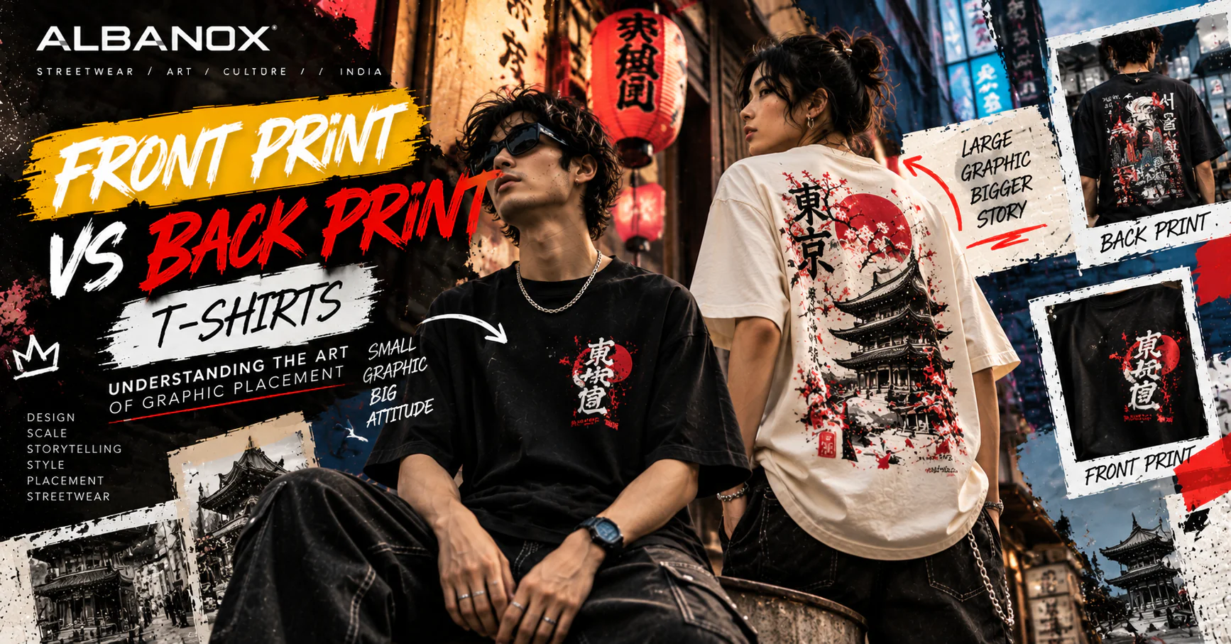
A graphic T-shirt is not just about what is printed. It is also about where the graphic lives. Move the same artwork from the back of a T-shirt to the chest and suddenly it can feel completely different. The scale changes. The visibility changes. The balance changes. Even the personality of the garment can change.
A small chest graphic can feel quiet and considered. A large back print can become the main statement of an outfit. Neither approach is automatically better. They simply tell different stories. And understanding that difference is one of the most interesting parts of T-shirt design.
Why Placement Matters
Imagine a graphic illustration. On a large back panel, it has room to breathe.
The designer can use:
- large typography
- detailed illustrations
- multiple visual elements
- photographic compositions
- cultural references
- layered textures
- storytelling elements
Now put the exact same artwork on the chest. Suddenly, everything feels compressed. Some details may disappear. Some typography may become difficult to read. The design might even start competing with the wearer's face and accessories.
That is why good T-shirt design isn't simply about creating a beautiful graphic. It is about understanding the relationship between artwork and garment.
The Chest Print: Small Space, Strong Identity
The front chest area is one of the most recognisable locations on a T-shirt. A small graphic can communicate a brand without dominating the outfit.
Think of:
- a small logo
- a symbol
- a short phrase
- a minimal illustration
- a small typographic mark
The result can feel understated. You notice it. But it doesn't demand all of your attention. This makes front prints particularly useful for people who want graphic clothing without wearing an extremely loud design.
Why Minimal Front Graphics Work
Minimal graphics create a certain kind of confidence. They don't need to explain everything immediately. A small mark on an oversized black T-shirt can sometimes communicate more than a huge graphic covering the entire front. It gives the rest of the outfit space.
The shoes can become visible. The trousers can create contrast. Accessories can contribute to the styling. The T-shirt becomes one part of the overall composition.
That's an important principle in streetwear:
The garment should work with the outfit, not fight against it.
The Back Print: A Larger Canvas
Now turn around. The entire back of the T-shirt becomes available. This changes everything. A designer suddenly has significantly more room to create a visual story.
A large back graphic can include:
- illustration
- photography
- typography
- symbols
- textures
- small annotations
- multiple layers
- artwork extending across the shoulder area
This is why back prints are often associated with statement streetwear. The front can stay relatively quiet. The back carries the story.
The Back of a T-Shirt Is Almost a Poster
Think about a street poster. It has a large visual field. A headline. Supporting information. Images. Textures. Hierarchy.
A good back print can work in a similar way. The T-shirt becomes a moving poster. Someone sees the wearer walking away and the graphic communicates something.
It could be an artwork. A phrase. A fictional world. A visual experiment. A cultural reference. Or simply a composition that looks good.
The important thing is hierarchy. The eye should know where to look first.
Large Doesn't Mean Better
One common mistake in graphic T-shirt design is assuming that the bigger the print, the stronger the design. Not always.
A massive graphic can become visually heavy. Too many colours can make it difficult to understand. Too many fonts can destroy hierarchy. Too many small elements can turn the design into noise. Good large graphics still need restraint.
Even a complex back print needs:
- a focal point
- visual hierarchy
- negative space
- balance
- a clear concept
The size gives the designer freedom. It doesn't remove the need for discipline.
Front and Back Can Work Together
Some of the most interesting T-shirts don't choose between front and back. They use both. But they don't necessarily repeat the same artwork.
For example:
- Front: Small ALBANOX wordmark. Back: Large original graphic composition.
Or:
- Front: Small Japanese-inspired typography. Back: Large illustration with a completely different visual scale.
Or:
- Front: Small symbol. Back: A visual story connected to that symbol.
This creates a relationship between both sides of the garment. The front introduces the idea. The back develops it.
The Front Can Be the Beginning
Think of a T-shirt like a story. The front can be the title. The back can be the main chapter.
A small symbol on the chest can create curiosity. Then the back reveals the complete artwork. This approach works particularly well for editorial or concept-driven streetwear.
The wearer doesn't have to explain the graphic. The garment does it visually.
Typography Changes With Placement
Typography is another area where placement matters enormously. A short phrase might work beautifully on the chest. A longer statement may need the space of the back.
Large typography can become the primary graphic. Small typography can function almost like a signature. Vertical typography can create a completely different silhouette. Even the direction of the text can influence how the garment feels.
For example:
- small horizontal text → subtle
- large centred text → bold
- vertical text → experimental
- curved typography → dynamic
- scattered type → editorial
The words may remain the same. The composition changes the message.
Cultural Typography Needs More Care
This becomes especially important when using Japanese or Korean typography.
If a designer uses:
東京 the characters have a real meaning: Tokyo.
If using:
서울 the word refers to Seoul.
These aren't just decorative shapes. They communicate something.
That's why cultural typography should always be checked for:
- correct characters
- correct spelling
- intended meaning
- appropriate context
- visual readability
A good cultural-inspired graphic should respect the language it references.
Back Prints and Storytelling
A back print gives a designer the opportunity to create a world. Imagine a T-shirt inspired by urban night photography.
The front might have:
ALBANOX / AFTER DARK
The back could show:
- city lights
- abstract photography
- large typography
- small location-style annotations
- a central illustration.
Now the garment isn't simply “a graphic T-shirt.” It has an atmosphere. That's where graphic design becomes storytelling.
Why Graphic Scale Changes the Way a T-Shirt Feels
Graphic scale affects perception. A tiny graphic can make an oversized T-shirt feel refined. A medium graphic can create balance. A large back print can make the garment feel more expressive. A full-panel composition can push it toward editorial fashion.
This is why two T-shirts with the same colour and silhouette can feel completely different. The graphic changes the visual weight.
The Relationship Between Fit and Print
Graphic placement also has to consider the fit. An oversized T-shirt has more surface area. The shoulder seam may sit lower. The sleeve may be wider. The body may be longer. That means the same artwork can behave differently compared with a regular-fit T-shirt.
A graphic designed specifically for an oversized silhouette can take advantage of:
- wider proportions
- larger back area
- lower visual centre
- broader sleeves
- more negative space
This is why simply scaling a regular T-shirt graphic up isn't always enough. The artwork should understand the garment.
Where Should a Graphic Sit?
There is no universal formula. But designers can think about a few basic areas.
Upper Chest
Works well for logos, symbols and compact typography.
Centre Chest
Creates a stronger visual statement.
Lower Front
Can create a more unconventional editorial feeling.
Upper Back
Useful for typography and small-to-medium graphics.
Centre Back
The classic location for a major statement graphic.
Full Back
Ideal for detailed compositions and storytelling.
Sleeve
Useful for secondary details, symbols or small typography.
The strongest designs often combine more than one placement without making every area equally busy.
The Power of Negative Space
One of the most overlooked elements in T-shirt graphics is empty space. A graphic doesn't need to touch every edge. Space creates breathing room.
Imagine a large back illustration with a wide area of blank fabric around it. The artwork immediately feels more intentional. Now imagine that same graphic stretched until it reaches every available area. The design may feel heavier.
Negative space isn't absence. It is part of the composition.
How to Choose Between Front and Back Print
If you're designing or buying a graphic T-shirt, ask yourself what you want the garment to communicate.
Choose a Front Graphic If:
- You prefer subtle branding.
- You want the graphic visible when facing someone.
- You want more flexibility with layering.
- You prefer a cleaner outfit.
- You want the artwork to interact with accessories and outerwear.
Choose a Back Graphic If:
- You want a stronger statement.
- You enjoy illustrated artwork.
- You want more visual storytelling.
- You like editorial streetwear.
- You want the graphic to become the centre of the garment.
Choose Both If:
- You want the front and back to tell a connected story.
Front Print vs Back Print
| Front Print | Back Print |
|---|---|
| More visible from the front | More visible from behind |
| Usually smaller | Often larger |
| Works well for subtle graphics | Works well for statement graphics |
| Good for logos and symbols | Good for storytelling |
| Easier to layer | Stronger visual impact |
| Often minimal | Can be highly detailed |
| More restrained | More expressive |
But this isn't a strict rule. Design is flexible. A huge front print can work. A tiny back graphic can work.
The question isn't what is technically normal. The question is whether the placement supports the concept.
When the Graphic Becomes the Outfit
There are moments when the T-shirt itself becomes the centre of the outfit. A large graphic back print can do that. In that situation, everything else can become quieter.
- Relaxed trousers.
- Simple sneakers.
- Minimal accessories.
- Neutral outerwear.
The graphic becomes the visual anchor. This is particularly effective with complex artwork. If the T-shirt already carries a lot of visual information, the rest of the outfit doesn't necessarily need to compete.
Designing for Real Life
A beautiful design on a screen isn't automatically a good T-shirt design. It has to work when someone actually wears it.
- The graphic may bend when the wearer sits.
- The shoulder may move.
- The fabric may fold.
- The design may appear under a jacket.
- The sleeve may cover part of a print.
- The wearer may carry a bag across the artwork.
These practical details matter. Good apparel design considers movement.
A Graphic T-Shirt Is a Moving Canvas
Unlike a poster, a T-shirt doesn't stay flat. It moves. It folds. It stretches. It interacts with the body. It appears differently from different angles.
That's why clothing graphics need to be designed for the human form. A design that looks perfect on a flat mockup may feel completely different once worn. The best graphics are designed with movement in mind.
The ALBANOX Approach
At ALBANOX, the idea isn't simply to decide: “Front or back?” The more interesting question is: “Where does this artwork belong?”
Some graphics want to stay quiet. Some want to be seen. Some need space. Some need restraint. Some begin with a small symbol and expand into a large story.
That's why graphic placement should be treated as part of the design itself. Not an afterthought.
Designing With Intention
A good graphic T-shirt usually starts with an idea. Then comes the artwork. Then typography. Then colour. Then composition. And finally: Where should it live?
That last decision can completely change the garment. A powerful artwork in the wrong place can feel ordinary. A simple artwork in exactly the right place can feel unforgettable. That's the difference placement can make.
Final Thought
A T-shirt has two sides. But good design can make both sides feel connected. The front can whisper. The back can speak. The sleeve can leave a small clue. And the person wearing it completes the story.
That's the beauty of graphic streetwear. It's not only about what is printed. It's about where it is placed, how it moves and what it makes you feel.
Design has a place. Give it the right one.
WEAR THE HORIZON.