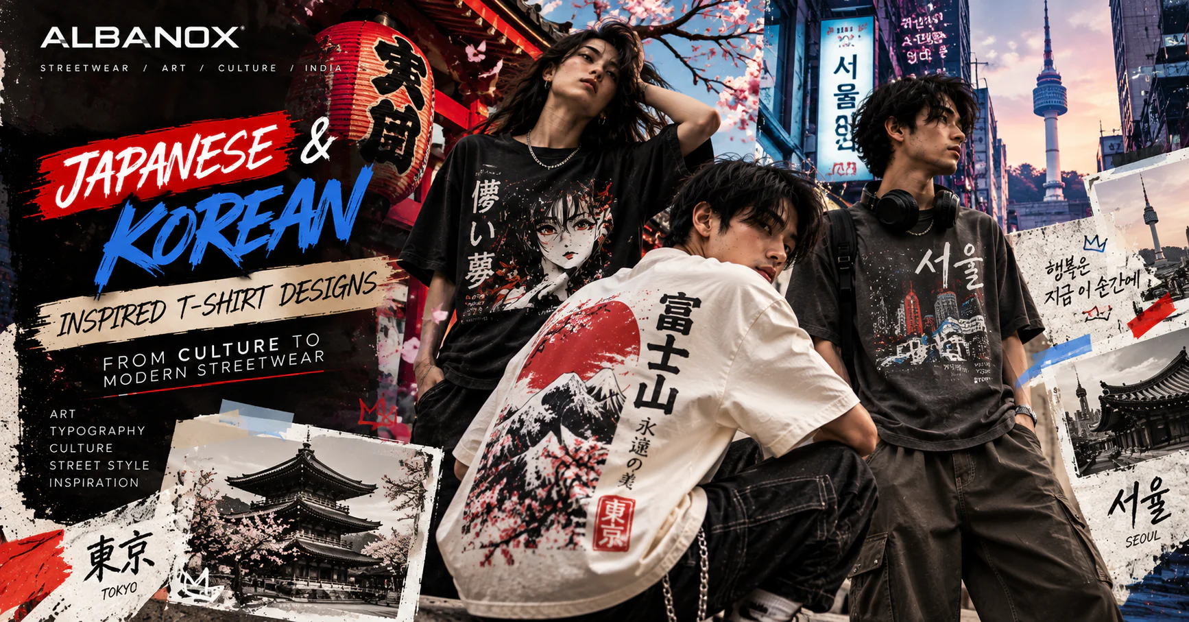
Japanese & Korean Inspired T-Shirt Design in Modern Streetwear
When Culture Becomes a Graphic
A T-shirt can say a lot without saying very much. Sometimes it is the silhouette. Sometimes it is the colour. Sometimes it is one small word printed across the chest. And sometimes, a graphic carries an entire atmosphere.
A city. A memory. A piece of art. A cultural reference.
A feeling that is difficult to explain but instantly recognisable. That is what makes Japanese and Korean visual culture so interesting for modern streetwear. Tokyo and Seoul have developed very different visual identities, yet both have influenced the way a younger generation thinks about clothing, graphics and self-expression.
Japanese design can feel precise, expressive and deeply connected to illustration, typography, traditional visual language and subculture. Korean fashion often plays with proportion, layering, restraint, colour and the relationship between clothing and everyday city life. And somewhere between these influences, a new kind of graphic T-shirt is emerging.
Not a copy of Japan. Not a copy of Korea. Something interpreted through a new generation of designers.
文化を着る。 Bunka o kiru. Wear the culture.
But culture should never be treated like decoration. It should be understood first.
Why Japanese and Korean Culture Feel So Natural in Streetwear
Streetwear has always travelled. Ideas move through music, art, films, photography, gaming, design, social media and people. A visual created in Tokyo can eventually appear on a moodboard in Mumbai. A styling idea from Seoul can influence someone getting dressed in Kolkata.
A graphic language from Japanese illustration can inspire an independent designer somewhere else entirely. That movement is normal. Fashion has never stayed inside borders. But inspiration becomes interesting only when it is transformed.
The goal isn't:
“How can we make a Japanese-looking T-shirt?”
The better question is:
“What can we learn from Japanese visual culture and turn into our own design language?”
The same question works for Korea.
The Japanese Approach: Detail, Contrast and Visual Storytelling
Japanese-inspired graphic design can be fascinating because it often allows several visual ideas to exist together. A traditional illustration can sit beside modern typography. A detailed drawing can be surrounded by empty space. A bold graphic can use a limited colour palette.
A vintage reference can be placed inside a contemporary composition. The result doesn't necessarily feel old. It feels layered. And that's an important lesson for T-shirt design.
A graphic doesn't have to be complicated to feel considered. Sometimes the smallest details create the strongest identity.
- A line.
- A texture.
- A symbol.
- A carefully chosen character.
- A slightly imperfect print effect.
- A piece of typography placed exactly where it needs to be.
Japanese Typography Is More Than Decoration
Japanese writing can become a powerful visual element because the shapes of the characters create a different rhythm from Latin typography. But there is a trap here. Using Japanese characters simply because they look fashionable can create a graphic that has no real meaning. That's not cultural design. That's decoration.
A better process starts with meaning. For example:
自分らしく着る。 Jibun rashiku kiru. “Wear it in your own way.”
The phrase itself becomes part of the story. Then the designer can decide how it should look.
- Vertical?
- Horizontal?
- Minimal?
- Handwritten?
- Large?
- Almost hidden inside the artwork?
Typography becomes part of the composition rather than something added at the end.
The Beauty of Japanese-Inspired Illustration
Japanese visual culture offers designers an enormous range of references.
- Nature.
- Mountains.
- Waves.
- Clouds.
- Flowers.
- Animals.
- Architecture.
- Urban signs.
- Illustration.
- Manga-inspired composition.
Traditional patterns. But taking inspiration does not mean reproducing an existing artwork. A designer can take the idea behind a visual language and rebuild it. For example: A wave can become an abstract movement.
A mountain can become a geometric silhouette. A traditional pattern can become a repeating texture. A historical visual composition can inspire a completely new poster-like graphic. The source of inspiration remains visible. But the final artwork becomes its own thing. That distinction is important.
Anime Changed the Way People Look at Graphic T-Shirts
There is another obvious influence. Anime. For many younger consumers, anime is not simply entertainment anymore. It is part of visual culture.
Characters, panels, typography, dramatic expressions, futuristic worlds and exaggerated compositions have all influenced fashion and graphic design. But there is a difference between anime merchandise and anime-inspired streetwear. The first depends on an existing intellectual property. The second can take inspiration from the visual language.
Think about: manga panel composition dramatic perspective speed lines expressive illustration monochrome artwork cinematic framing Japanese typography high-contrast graphics futuristic visual elements A designer doesn't need to borrow a famous character to create that energy. Sometimes creating an original world is much more interesting.
From Tokyo to Seoul
If Japanese-inspired design often gives us a relationship between tradition, illustration and graphic storytelling, Korean fashion brings another perspective. Seoul has become one of the most visually influential fashion cities in the world. Its street style often combines relaxed proportions with intentional styling. Oversized silhouettes.
Wide trousers. Layering. Minimal graphics. Muted colours.
Sneakers. Accessories. Clean typography. Then suddenly, one strong visual detail changes the entire outfit. That balance is what makes Korean-inspired fashion so interesting. It can look effortless without actually being accidental.
The K-Drama Effect
K-dramas have helped make Korean fashion more visible to audiences around the world. But the influence goes beyond individual outfits. What people often respond to is the overall visual language. A character might wear something extremely simple:
An oversized T-shirt.
- Loose trousers.
- A jacket.
- Sneakers.
- One accessory.
- Nothing looks particularly complicated.
Yet the combination feels intentional. That's a useful lesson for streetwear. Style doesn't always come from adding more. Sometimes it comes from knowing what to leave out.
Korean Typography Has a Different Energy
Hangul offers another fascinating design possibility. For example:
자신의 스타일을 입다. Jasin-ui seutail-eul ipda. “Wear your own style.”
The shapes themselves can become part of a composition. Large Hangul typography can create a strong editorial feeling. Small Hangul text can work almost like a label. It can sit beside English typography. Or it can become the main visual. Again, the important part is understanding what the words actually mean. Good design starts with language.
Seoul Street Style Meets the Indian Wardrobe
Here's where things get really interesting. Indian consumers don't have to copy Seoul. And they don't have to copy Tokyo. They can reinterpret both.
Because Indian streetwear has its own reality. Different weather. Different cities. Different lifestyles. Different cultural references. Different ways of wearing the same T-shirt.
An oversized graphic tee might work with:
- wide-leg denim
- cargo trousers
- relaxed shorts
- straight-fit jeans
- layered overshirts
- sneakers
The same T-shirt can look completely different depending on how it is styled. That's the beauty of cultural exchange. You don't simply import a style. You adapt it.
Why Oversized T-Shirts Work So Well
There is a reason oversized T-shirts keep appearing in conversations around Japanese, Korean and contemporary streetwear. The silhouette creates space. And space gives the graphic room to breathe. A small chest mark can feel understated.
A large back illustration can become the centre of an outfit. A vertical typography composition can run down the front. An illustrated scene can use the entire surface. The T-shirt becomes a canvas.
But that doesn't mean bigger is automatically better. Graphic size has to work with garment proportion. If everything is loud, nothing feels intentional.
The Art of Leaving Space
One of the easiest ways to make a graphic look more premium is to stop filling every available area. Empty space is not wasted space. It gives the eye somewhere to rest.
Imagine a black oversized T-shirt. A small Japanese-inspired phrase near the chest. A tiny ALBANOX mark. Nothing else. It can feel more sophisticated than a shirt covered from collar to hem. Now imagine the opposite.
A massive illustrated back graphic. Multiple layers. Typography. Textures. Small annotations. That can work too. The difference is intention. Minimalism and maximalism can both work when the composition knows what it is doing.
Colour: Tokyo, Seoul and Somewhere New
Culture can influence colour without dictating it.
Japanese-inspired graphics might explore:
- indigo
- off-white
- charcoal
- black
- muted red
- earth tones
Korean-inspired styling might explore:
- cream
- grey
- soft blue
- black
- beige
- deep burgundy
But there is no official Japanese colour palette. And there is no official Korean streetwear palette. That's exactly why designers have freedom. A designer might take a muted Japanese-inspired composition and introduce electric blue. Or take a restrained Seoul-inspired outfit and place an aggressive red graphic on the back. Contrast creates character.
When Traditional Meets Digital
This is perhaps where the most interesting T-shirt designs can emerge. Imagine a traditional-inspired wave illustration.
Now combine it with:
- digital distortion.
- pixel textures.
- modern typography.
- photographic fragments.
- barcode-like elements.
- contemporary symbols.
Suddenly the graphic doesn't feel historical. It feels contemporary.
The same idea can work with Korean-inspired visual language. Traditional typography principles can meet:
- editorial photography.
- minimal layouts.
- digital gradients.
- urban photography.
- modern type systems.
Streetwear is often strongest when two visual worlds collide.
Don't Turn Culture Into a Costume
This deserves its own section.
A Japanese-inspired T-shirt doesn't need:
- a samurai,
- a red sun,
- a dragon,
- Japanese characters,
- a manga character,
- all at the same time.
Likewise, a Korean-inspired design doesn't need:
- a K-pop idol,
- a K-drama character,
- Seoul Tower,
- Hangul everywhere,
- and neon signs on one shirt.
That isn't necessarily cultural design. It's visual shorthand. The stronger approach is subtle.
Take one idea. Understand it. Transform it. Build something new around it.
Inspiration vs Copying
This is where responsible design becomes important.
There is a huge difference between:
“I saw this design and recreated it.”
and
“I studied this visual language and created something new from what I learned.”
The first reproduces someone else's work. The second creates a new interpretation. For an original streetwear brand, the second direction is far more valuable. A good ALBANOX graphic should be recognisable because of its own design language—not because someone can immediately identify the original artwork it resembles.
What Makes a Culture-Inspired T-Shirt Feel Original?
Ask five questions.
01 — What is the idea?
What are you actually trying to communicate?
02 — What is the cultural reference?
Why Japan? Why Korea? What specifically inspired the design?
03 — What did you transform?
Did you redraw it? Recompose it? Change the typography? Create a new illustration?
04 — Does it mean something?
If the graphic contains Japanese or Korean text, is the meaning accurate?
05 — Would the design still work without the reference?
This is the strongest test. If removing the cultural reference destroys the entire design, perhaps the design depended too heavily on borrowed imagery. If the concept still works, you've probably created something stronger.
Japanese and Korean Inspiration Don't Have to Compete
There is no reason to choose one. They can coexist. A T-shirt could combine:
- Japanese-inspired illustration
- Korean typography
- Indian photography
- modern streetwear proportions.
The result doesn't need to be labelled Japanese or Korean. It can simply be contemporary. That's where global streetwear is heading. Borders become less important. Visual languages start talking to each other.
A New Generation of Cultural Streetwear
The next generation of graphic T-shirts may be less interested in obvious symbols and more interested in atmosphere. Instead of printing a famous character, designers can create an original illustrated world. Instead of copying a K-drama outfit, they can explore its silhouette. Instead of using Japanese text because it looks interesting, they can choose a meaningful phrase. Instead of recreating an existing artwork, they can study its composition and build a new one. That creates something much more personal.
What This Could Mean for ALBANOX
For ALBANOX, culture can become a starting point for experimentation. Not a template. Not a shortcut. A starting point.
Japanese-inspired graphics could explore:
- illustration + typography
- nature + urban design
- traditional references + digital distortion
- manga-inspired composition + original characters
Korean-inspired graphics could explore:
- Hangul + modern typography
- Seoul street photography + graphic overlays
- minimalism + oversized silhouettes
- editorial styling + bold back graphics
And Indian culture can enter the conversation too.
- Architecture.
- Local streets.
- Signs.
- Music.
- Cinema.
- Typography.
- Everyday life.
Now the design language becomes much bigger than one country.
The ALBANOX Philosophy
At ALBANOX, the interesting question isn't:
“Where did this style come from?”
It's:
“Where can we take it?”
Because inspiration is only the beginning. Culture gives us references. Art gives us emotion. Typography gives us language. Fashion gives us form. And the wearer gives the final meaning.
문화를 입고, 나를 표현하다. Munhwa-reul ipgo, nareul pyohyeonhada. Wear culture. Express yourself.
That is what modern streetwear can be. Not a uniform. Not a copy. A conversation between cultures, ideas and individuals.
Final Thought
Tokyo has its rhythm. Seoul has its own. India has another. And streetwear lives somewhere between all of them.
A Japanese illustration can inspire an Indian designer. A Seoul silhouette can influence a Kolkata wardrobe. An anime-inspired visual can evolve into an original graphic. A few Hangul characters can sit beside English typography. A traditional reference can become a completely modern composition.
The important thing isn't where the inspiration started. It's what you create from it.
文化はインスピレーション。 スタイルは自分のもの。 Culture is inspiration. Style is your own.
And perhaps that's the real point of a graphic T-shirt. You don't wear it simply because it looks good. You wear it because, somehow, it feels like you.
WEAR THE HORIZON.