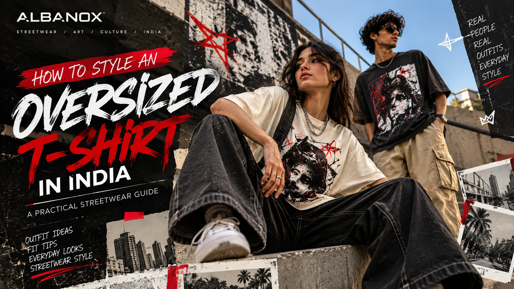
A good graphic T-shirt does more than fill space on a blank piece of fabric.
It can introduce a visual idea, reference a mood, start a conversation or simply feel like something that belongs to you.
That is part of what makes graphic T-shirts such an important part of modern streetwear. The T-shirt remains simple, but the graphic gives it a point of view.
The difficult part is choosing the right one.
With thousands of printed T-shirts available online, it is easy to focus only on the artwork you notice first. But a graphic that looks interesting on a product thumbnail may feel completely different when you wear it.
The design, fit, colour, print placement and overall construction all work together.
So what actually makes a graphic T-shirt worth wearing?
What Is a Graphic T-Shirt?
A graphic T-shirt is essentially a T-shirt where artwork, typography, illustration, photography, symbols or another visual composition becomes an important part of the garment.
The graphic can be small and understated.
It can cover the back.
It can sit across the chest.
Or it can become the main visual feature of the entire T-shirt.
That flexibility is exactly why graphic tees have become such a useful part of streetwear.
The T-shirt provides the canvas.
The graphic provides the language.
The First Question: Does the Graphic Mean Something to You?
Before thinking about trends, ask a simpler question:
Would you still want to wear this graphic if nobody knew the brand?
That question can help separate a design you genuinely like from something you are considering only because it is currently popular.
A graphic might connect with you because of its artwork.
It might remind you of a particular culture, era, idea or visual style.
It might simply have a composition that feels right.
There does not have to be a complicated explanation behind every T-shirt you wear.
Sometimes you just like the image.
That is enough.
1. Start With the Artwork
The artwork is usually the first thing people notice.
Look at the composition rather than just the subject:
- Does the graphic have a clear focal point?
- Does it have enough breathing room?
- Do the colours work together?
- Does the illustration feel intentional?
A strong graphic does not necessarily need to be complicated.
A simple symbol, carefully designed typography or a restrained illustration can have more impact than a graphic containing too many unrelated elements.
The goal is visual clarity.
2. Typography Can Be the Entire Graphic
Not every graphic T-shirt needs an illustration.
Typography can carry an entire design.
A single word.
A short phrase.
A carefully arranged sentence.
A distorted type treatment.
A combination of different type sizes.
The important part is that the typography feels designed rather than simply placed on the shirt.
Look at:
- font choice
- spacing
- scale
- alignment
- contrast
- placement
A strong typographic graphic can remain visually interesting even when the message is extremely simple.
3. Illustration and Artwork
Illustrated graphic T-shirts give designers much more room to build a visual world.
An illustration can be expressive, abstract, surreal, minimal or heavily detailed.
When choosing one, look beyond whether you like the subject.
Ask whether the illustration has its own visual character:
- Does it feel memorable?
- Does it have a recognisable style?
- Does the composition work with the shape of the T-shirt?
The best artwork does not feel like decoration added at the last stage.
It feels like the T-shirt was designed around it.
4. Front Print, Back Print or Both?
Print placement can completely change the personality of a graphic T-shirt.
Front Graphic
A front graphic is immediately visible and often works well when you want the artwork to become part of the outfit's main visual language.
Back Graphic
A back print can create a more editorial streetwear feel.
From the front, the T-shirt may appear relatively minimal.
From behind, the artwork becomes the statement.
Front and Back Graphic
Using both sides can create a more complete visual story.
The front might carry a small symbol or wordmark while the back carries the main artwork.
This approach works particularly well when the two graphics are designed as part of the same concept.
5. Think About Colour Before You Think About Trends
Colour is one of the easiest ways to decide whether a graphic T-shirt will actually fit into your wardrobe.
A black or white T-shirt can make a colourful graphic feel more prominent.
Neutral graphics can create a quieter look.
A coloured T-shirt can become part of the graphic itself when the base colour is considered during the artwork stage.
Try to think about the T-shirt as one visual composition rather than separating the garment and the print.
The base colour, print colour and surrounding outfit should work together.
6. How the Graphic Works With the Fit
A graphic and a silhouette should support each other.
This becomes particularly important with oversized T-shirts.
A larger surface gives artwork more space.
But more space does not automatically mean that the graphic should become enormous.
Large artwork can work when the composition has enough structure.
Smaller artwork can work when the rest of the silhouette provides the visual presence.
The important thing is proportion.
A graphic that looks balanced on a regular-fit T-shirt may need a different scale or placement on an oversized silhouette.
7. Original Artwork vs Generic Graphics
The internet has made it incredibly easy to reproduce visual trends.
That also means it has become harder to create something that feels genuinely distinctive.
When choosing a graphic T-shirt, look for signs of an actual design point of view.
Ask:
- Does the artwork have a recognisable visual language?
- Does the composition feel intentional?
- Does it look like it belongs to a specific creative direction?
- Is the brand simply following a trend or developing its own perspective?
Original artwork can make a T-shirt feel more personal because it gives the garment an identity beyond a generic fashion reference.
At ALBANOX, that idea is central to the way we think about graphic-led streetwear.
The graphic should not feel like an afterthought.
It should be part of why the garment exists.
8. Graphic T-Shirts and Personal Style
There is no universal definition of a good graphic T-shirt.
Someone may prefer minimal typography.
Someone else may want oversized artwork covering the back.
Another person may choose abstract graphics.
Someone else may want something playful.
That is the point.
Your graphic T-shirt collection can become a visual record of your interests.
You can keep your everyday wardrobe minimal and let one graphic become the statement.
Or you can build an entire outfit around the artwork.
There is no single correct approach.
9. How to Wear a Graphic T-Shirt Without Overdoing It
The easiest styling principle is simple:
Give the graphic enough space to be seen.
If the T-shirt already has a strong visual identity, consider keeping the trousers relatively clean.
Try:
- graphic tee + straight-leg denim
- graphic tee + cargo trousers
- graphic tee + relaxed trousers
- oversized graphic tee + shorts
- graphic tee + open overshirt
You do not need another large graphic on every other part of the outfit.
A strong T-shirt can carry the look by itself.
10. Graphic T-Shirts for Everyday Indian Style
A graphic T-shirt needs to work in real life.
India's climate, commuting patterns and everyday routines can influence how you wear one.
For warmer days, a breathable T-shirt with relaxed trousers or shorts can keep the outfit comfortable.
For college, pair a graphic tee with denim, cargos or relaxed trousers and everyday sneakers.
For a casual evening, a darker colour palette and more structured trousers can make the same graphic T-shirt feel more refined.
During cooler weather, layer it under an overshirt, denim jacket or lightweight outer layer.
The graphic remains the foundation.
The styling changes around it.
11. What to Look for in the Print
The visual quality of a graphic is only part of the equation.
The print should also work with the garment.
Look closely at the edges of the artwork.
They should appear clean and intentional.
The placement should be straight and proportionate.
The graphic should not feel like it was simply dropped onto a blank T-shirt.
If you can see the physical product, also pay attention to how the print feels and how it interacts with the fabric.
A good graphic T-shirt should feel like one product—not a blank T-shirt carrying a separate image.
12. Do Not Ignore the Size Guide
A great graphic can still look wrong if the fit is wrong.
This is particularly important for oversized T-shirts.
Do not assume that going one or two sizes above your normal size will automatically create the intended oversized silhouette.
Different brands use different measurements.
Instead, compare the garment measurements with a T-shirt you already own and like.
Pay attention to:
- chest width
- body length
- shoulder width
- sleeve length
The graphic placement also changes visually depending on where the garment sits on your body.
The right fit gives the artwork the right frame.
13. Choosing a Graphic T-Shirt for Men and Women
Graphic T-shirts are not restricted to one type of wardrobe.
The same artwork can be styled in very different ways.
For a more traditional streetwear silhouette, try an oversized graphic tee with relaxed trousers or cargos.
For a cleaner look, use a regular or relaxed-fit graphic tee with straight-leg denim.
Women can style oversized graphic tees with wide-leg trousers, denim, shorts, skirts or layered pieces depending on the desired silhouette.
The important thing is not whether a graphic T-shirt is labelled for men or women.
The important thing is whether the cut, measurements and styling work for you.
14. Three Graphic Styles Worth Exploring
Rather than chasing every new trend, it can be useful to understand a few broad visual directions.
Typography
Clean words, phrases and experimental type compositions.
Best for people who want the message to become part of the outfit.
Illustration
Character-driven, artistic or detailed visual compositions.
Best for people who want the artwork itself to become the focal point.
Abstract Graphics
Shapes, symbols, textures and non-literal visual language.
Best for people who prefer a more open-ended interpretation.
None of these is inherently better.
The right choice depends on what you want your clothes to communicate.
15. When a Graphic T-Shirt Becomes More Than a Trend
Trends change quickly.
A good graphic can remain interesting long after the original trend disappears.
That usually happens when the design has something beyond trend recognition.
A strong composition.
A memorable image.
A thoughtful phrase.
An interesting colour relationship.
A distinctive visual language.
This is where graphic design becomes more important than fashion forecasting.
You are not simply choosing what is popular.
You are choosing what you want to keep wearing.
The ALBANOX Approach to Graphic Streetwear
At ALBANOX, we see the graphic T-shirt as a meeting point between clothing and visual expression.
The artwork is not there simply to fill an empty space.
It is part of the identity of the garment.
That is why the relationship between graphic, fit, colour and silhouette matters.
A T-shirt should be comfortable enough to live in.
The design should be distinctive enough to remember.
And the final combination should feel like something you chose—not something a trend chose for you.
Final Thought
The best graphic T-shirt is not necessarily the loudest one.
It is the one that feels right when you wear it.
Choose artwork you genuinely connect with.
Look at the proportions.
Consider the colour.
Understand the fit.
Pay attention to the print.
And give the graphic enough room to become part of your style.
Because clothing does not need to explain everything about you.
Sometimes one image is enough.
Wear the horizon.